Longitudinal data is very exciting as it enables us to look at change in time, get a better understanding of causal relationships and explain events and their timing. In order to make use of this type of data typically we need to move beyond classical statistical methods, such as OLS regression and ANOVA, to models that can deal with the extra
complexity of the data.
One popular model for analyzing longitudinal data is the MultiLevel Model for Change (MLMC). This enables the estimation of change in time while taking into account the hierarchical nature of the data (multiple points in times nested within individuals). It is similar to the Latent Growth Model but is estimated using the multilevel model framework (also known as hierarchical modeling or random effects) and uses the long data format (each row is a specific time point for an individual).
More precisely the MLMC can help:
- understand how individual and aggregate change happens in time
- explain change using time varying and time constant predictors
- decompose variance in between and within variation
- easily deal with continuous time, unbalanced data (not all individuals are present at all times) and different timings (not everyone gives data at the same time)
Here I’m going to give a high level introduction to MLMC, how to estimate it in R and how to visualize change using it.
First let’s load the packages. We will use tidyverse for cleaning and visualizing the data and lme4 for running the MLMC in R.
You can install packages using install.packages() command.
# package for data cleaning and visualization
library(tidyverse)

# package for multilevel modeling
library(lme4)
Before we get into the MLMC let’s have a look at the data we want to analyze. Here I use the log income from the first six waves of the Understanding Society survey. This is a large representative panel of the general population in the UK. You can freely access the data from the UK Data Archive.
Let’s imagine we are interested in how income changes in time and what are the main sources of that change. More precisely we want to separate between variation, how people change compared to others, and within variation, how people vary relative to their own average/trend.
Let’s explore the data. First let’s look at the long data that we will use for the modeling and graphs:
head(usl, n = 10)

## # A tibble: 10 x 3
##    pidp   wave logincome
##    <fct> <dbl>     <dbl>
##  1 1         1      7.07
##  2 1         2      7.20
##  3 1         3      7.21
##  4 1         4      7.16
##  5 1         5      7.11
##  6 1         6      7.21
##  7 2         1      7.15
##  8 2         2      7.10
##  9 2         3      7.15
## 10 2         4      6.86
We see that each row is a combination of individual (variable “pidp”) and time (variable “wave”). This is also the format we need for doing visualization using ggplot2.
To see what we will be modeling we can make a simple graph showing the average change in time for the whole data as well as lines for the change of each individual:
ggplot(usl, aes(wave, logincome, group = pidp)) +
  geom_line(alpha = 0.01) + # add individual line with transparency
  stat_summary( # add average line
    aes(group = 1),
    fun = mean,
    geom = "line",
    size = 1.5,
    color = "red"
  ) +
  theme_bw() + # nice theme
  labs(x = "Wave", y = "Logincome") # nice labels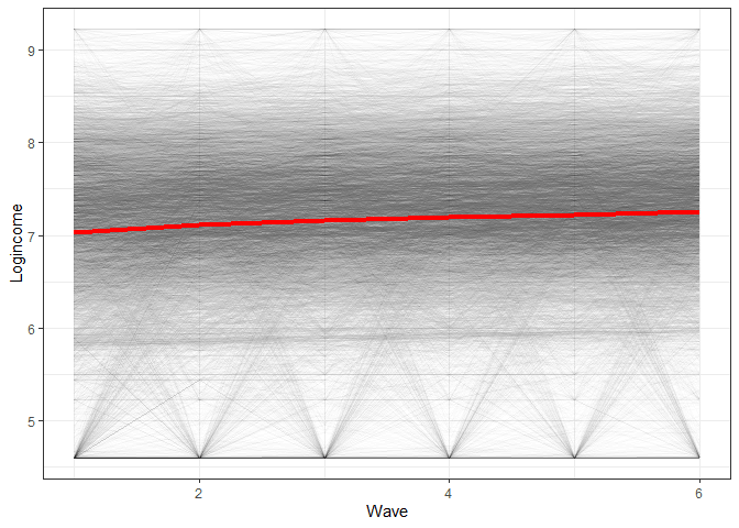
So we see a positive average change in time but also quite a lot of variation in the way people change (gray lines all over the place). MLMC is able to estimate both of these things at the same time!
What is multilevel modelling?
Multilevel modeling is an extension of regression modeling in which we can decompose different sources of variation. Why is this important?
Traditional, OLS regression assumes that all the cases are independent. This implies that there is no correlation between the observed measures due to things like clustering. This is often not true in social science data. For example, individuals are nested within households, neighborhoods, regions and countries. Students are nested in classes, schools, regions and countries. This nested structure makes individuals similar to each other. For example, health outcomes will probably be similar for people living in the same neighborhood because of self-selection (similar income and education), quality of health provision or air quality. If this is true, then we can’t treat people coming from the same neighborhood as independent.
Multilevel modeling solves this issue by estimating random effects (i.e., variation) for the different levels present in the data. In this way the regression coefficients (like standard errors) will be corrected for this nested structure. Additionally, these types of models can estimate how much variation comes from each level. This can be very informative. For example, by decomposing the variation of student outcomes in student level, class level and school level we can understand what are the main factors impacting the grades of the students. This can inform theory and policy.
Multilevel modeling and longitudinal data
Longitudinal data is also nested. Measures at different points in time are nested within an individual. These observations are not independent, as stable individual characteristics (like genes, personality or context) lead to consistent responses within the individuals and across time. So, multilevel modeling can help correct for this nesting but also facilitate the separation of two main sources of variation in longitudinal data: between variation and within variation. The former refers to how individuals differ from each other in the outcome of interest (e.g., one individual has on average a higher income compared to another) while the latter refers to how the measure is different in a particular year compared to the individual average (e.g., do they have a lower or higher income compared to their normal income).
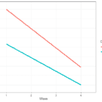
To better understand these sources of variation let’s look at this graph:
Here we see log income for two individuals as well as the individual trends in time. We can think of between variation as the difference between the lines. This tells us if the trend for one individual is different to another. If this source of variation would be 0 then all the lines would be the same. If individuals have very different lines, then this will be an important source of variation. Within variation refers to the difference between the individual trend and the associated observed scores. If this source of variation would be 0 then we would perfectly predict income at each wave and there would be no within
variation. The larger this source of variation the more individual values fluctuate around their own trend.
The unconditional change model (a.k.a. random effects)
Now that we have a basic understanding of multilevel modeling and longitudinal data we can try them out. We typically start from a simple model that just aims to separate within and between variation. We can define the model as:
Yij = γ00 + ξ0i + ϵij
Where:
- Yij is the variable of interest (for example log income) and it varies by individual (i) and time (j)
- γ00 is the intercept in the regression. We can interpret it as the grand mean or the average of the outcome over all the individuals and time points
- ξ0i is the between variation and tells us how different are people from each other in their logincome. If everyone has the same income this would be 0. The large the differences the bigger this coefficient will be
- ϵij this is the residual but also has here the interpretation of within variation and tells us how much each individual varies around their average. The larger this coefficient the more individuals fluctuate in their outcomes
Now that we know what we want to model let’s see how to do that in Rand lme4. For estimating multilevel models we will use the lmer()command. We need to give the data and the formula. Our outcome is “logincome”, so that is on the left side of ~. On the right side we have “1”, which stands for the intercept. In the brackets we define the random effects. Here we say that we want the intercept (“1”) to vary by individual (“| pidp”). This all leads to this syntax:
# unconditional means model (a.k.a. random effects model)
m0 <- lmer(data = usl, logincome ~ 1 + (1 | pidp))

# check results
summary(m0)

## Linear mixed model fit by REML ['lmerMod']
## Formula: logincome ~ 1 + (1 | pidp)
##    Data: usl
##
## REML criterion at convergence: 101669.8
##
## Scaled residuals:
##     Min      1Q  Median      3Q     Max
## -7.2616 -0.2546  0.0627  0.3681  5.8845
##
## Random effects:
##  Groups   Name        Variance Std.Dev.
##  pidp     (Intercept) 0.5203   0.7213
##  Residual             0.2655   0.5152
## Number of obs: 52512, groups:  pidp, 8752
##
## Fixed effects:
##             Estimate Std. Error t value
## (Intercept) 7.162798   0.008031   891.8
So let’s interpret the main coefficients:
- under “Fixed effects” we have the “(Intercept)”, 7.16, which is the grand mean (γ00) and tells us that over all the time points and individuals the average logincome is 7.16
- under “Random effects” everything that varies by “pidp” represents between variation. In this case the between variation for the intercept (ξ0i) is 0.52
- under “Random effects” the “Residual” coefficient represents within variation. In this case the within variation for the intercept (ϵij) is 0.26
To make the between and within variation easier to understand we can calculate the InterClass Coefficient (ICC):
ρ = σ0/(σ0 + σϵ) = 0.520/(0.520 + 0.265) = 0.662
Where the σ0 stands for the between variation and σϵ within variation. So this is just a ratio of the between variation out of the total variaton and tells us the proportion of variation that is between individuals. In our case it shows that around 66% of the variation in logincome comes between people while the remaining (~ 34%) is within people. Substantively this would indicate that the differences between people in income are more important that the within one (i.e., I can work as much as I want but it’s very unlikely that I will become the next Jeff Bazos).
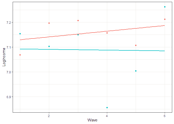
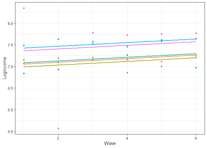
To better understand what the model does we can predict the scores and do a graph showing the predicted individual score (lines) and the observed ones (points) for five individuals:
# let's look at prediction base on this model
usl$pred_m0 <- predict(m0)


usl %>%
  filter(pidp %in% 1:5) %>% # select just five individuals
  ggplot(aes(wave, pred_m0, color = pidp)) +
  geom_point(aes(wave, logincome)) + # points for observer logincome
  geom_smooth(method = lm, se = FALSE) + # linear line based on prediction
  theme_bw() + # nice theme
  labs(x = "Wave", y = "Logincome") + # nice labels
  theme(legend.position = "none") # hide legend
A few things to notice here. We are basically predicting just one score for each individual so at this point we don’t have any change in time (lines are horizontal). The differences between the lines represent between variation (e.g., blue is higher than green) while the difference between lines and points of the same color represents within variation (observed individual scores are different to their prediction).
The unconditional change model
The previous model is useful to give us an idea of how much variation we have at each level but we want to look at change in time as well! So let’s expand the model:
Yij = γ00 + γ10TIMEij + ξ0i + ϵij
In this model we add time (“wave” in our case) as a predictor. Now γ00 will represent average income when time is 0 while γ10 represents the rate of change of income when times goes up by 1.
To make things easier to interpret let’s change our time variable a little. We want it to start from 0 so the γ00 has the nice interpretation of expected log income at the start of the study. So here we use a new variable where we subtract 1 from wave:
# create new variable starting from 0
usl <- mutate(usl, wave0 = wave - 1)

# see how it looks like
head(usl, n = 10)

## # A tibble: 10 x 5
##    pidp   wave logincome pred_m0 wave0
##    <fct> <dbl>     <dbl>   <dbl> <dbl>
##  1 1         1      7.07    7.16     0
##  2 1         2      7.20    7.16     1
##  3 1         3      7.21    7.16     2
##  4 1         4      7.16    7.16     3
##  5 1         5      7.11    7.16     4
##  6 1         6      7.21    7.16     5
##  7 2         1      7.15    7.09     0
##  8 2         2      7.10    7.09     1
##  9 2         3      7.15    7.09     2
## 10 2         4      6.86    7.09     3
Now we can run our model. We just add the new time variable as a fixed effect:
# unconditional change model (a.k.a. MLMC)
m1 <- lmer(data = usl, logincome ~ 1 + wave0 + (1 | pidp))
summary(m1)

## Linear mixed model fit by REML ['lmerMod']
## Formula: logincome ~ 1 + wave0 + (1 | pidp)
##    Data: usl
##
## REML criterion at convergence: 100654.8
##
## Scaled residuals:
##     Min      1Q  Median      3Q     Max
## -7.1469 -0.2463  0.0556  0.3602  5.7533
##
## Random effects:
##  Groups   Name        Variance Std.Dev.
##  pidp     (Intercept) 0.5213   0.7220
##  Residual             0.2593   0.5092
## Number of obs: 52512, groups:  pidp, 8752
##
## Fixed effects:
##             Estimate Std. Error t value
## (Intercept) 7.057963   0.008665  814.51
## wave0       0.041934   0.001301   32.23
##
## Correlation of Fixed Effects:
##       (Intr)
## wave0 -0.375
The main difference from the previous model is in the fixed effects part. Now we interpret the intercept (7.057) as the expected logincome at the beginning of the study (wave 1). The effect of “wave0”, 0.419, tells us the average rate of change with the passing of a wave. So individual logincome is slowly increasing each wave.
Again, let’s visualize the results based on the model:
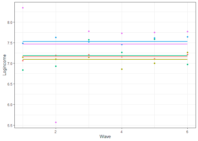
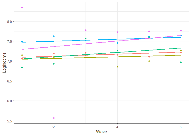
# let's look at prediction base on this model
usl$pred_m1 <- predict(m1)


usl %>%
  filter(pidp %in% 1:5) %>% # select just five individuals
  ggplot(aes(wave, pred_m1, color = pidp)) +
  geom_point(aes(wave, logincome)) + # points for observer logincome
  geom_smooth(method = lm, se = FALSE) + # linear line based on prediction
  theme_bw() + # nice theme
  labs(x = "Wave", y = "Logincome") + # nice labels
  theme(legend.position = "none") # hide legend
So now we see a positive trend which is due to the coefficient for time. We also notice that the lines are parallel. This means that we assume the change in time is the same for all the individuals. In more technical terms we assume there is no between variation in the rate of change. This is typically quite a strong assumption. In our case we wouldn’t expect that given the first graph we created (which showed individual lines all over the place). So let’s expand the model to include the between variation in the rate of change:
Yij = γ00 + γ10TIMEij + ξ0i + ξ1iTIMEij + ϵij
Now we see that we have two sources of between variation. The coefficient ξ0i represents the between variation at the start of the study while ξ1i represents the between variation in the rate of change. This means that we allow individuals to have different logincomes at wave 1 but also different trends.
To run such a model in lme4. We can simply add “wave0” to the random part of the model:
# unconditional change model (a.k.a. MLMC) with re for change
m2 <- lmer(data = usl, logincome ~ 1 + wave0 + (1 + wave0 | pidp))
summary(m2)

## Linear mixed model fit by REML ['lmerMod']
## Formula: logincome ~ 1 + wave0 + (1 + wave0 | pidp)
##    Data: usl
##
## REML criterion at convergence: 98116.1
##
## Scaled residuals:
##     Min      1Q  Median      3Q     Max
## -7.8825 -0.2306  0.0464  0.3206  5.8611
##
## Random effects:
##  Groups   Name        Variance Std.Dev. Corr
##  pidp     (Intercept) 0.69590  0.8342
##           wave0       0.01394  0.1181   -0.51
##  Residual             0.21052  0.4588
## Number of obs: 52512, groups:  pidp, 8752
##
## Fixed effects:
##             Estimate Std. Error t value
## (Intercept) 7.057963   0.009598  735.39
## wave0       0.041934   0.001723   24.34
##
## Correlation of Fixed Effects:
##       (Intr)
## wave0 -0.558
## optimizer (nloptwrap) convergence code: 0 (OK)
## Model failed to converge with max|grad| = 0.00403437 (tol = 0.002, component 1)
You can ignore the warning regarding convergence for now.
In the results we see that the random part of the model has now two coefficients that vary by “pidp”. The “(Intercept)”, 0.6959, represents between variation at the starting point of the study (ξ0i) while, the coefficient for “wave0”, 0.0139, represents between variation in the rates of change (ξ1i).
If we now investigate the predictions we see that individuals are allowed to have both different starting points and different trends:
# let's look at prediction base on this model
usl$pred_m2 <- predict(m2)


usl %>%
  filter(pidp %in% 1:5) %>% # select just two individuals
  ggplot(aes(wave, pred_m2, color = pidp)) +
  geom_point(aes(wave, logincome)) + # points for observer logincome
  geom_smooth(method = lm, se = FALSE) + # linear line based on prediction
  theme_bw() + # nice theme
  labs(x = "Wave", y = "Logincome") + # nice labels
  theme(legend.position = "none") # hide legend
The larger the ξ0i coefficient the larger the difference between people at the start of the study while larger ξ1i indicates more diverse rates of change.
Conclusions
Hopefully this gives you an idea about what is the multilevel model for change, how to estimate it in R and how to visualize this change. The model can be expanded in different ways. For example here we discuss how you run estimate non-linear models and here we discuss how to add time constant predictors to the model. This model is similar to the Latent Growth Model and I made an introduction to that here. If you liked this you can have a look at training that I offer as well as other blog posts, such as this one looking at visualizing transition in time for categorical variables.
If that was useful you might also like the Longitudinal Data Analysis Using R book.
This covers everything you need to work with longitudinal data. It introduces the key concepts in longitudinal data, the basics of R and regression. It also shows using real data how to prepare, explore and visualize longitudinal data. In addition, it covers in depth popular statistical models such as the multilevel model for change, the latent growth model and the cross-lagged model.
More blog posts
 Explaining change in time using multilevel models and time constant predictors
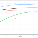 Estimating non-linear change in time using the multilevel model for change
 Summer schools in applied statistics and survey methodology 2023
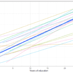 Estimating change in time. Comparing the multilevel model for change with the Latent Growth Model
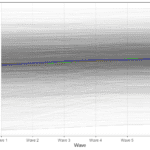 Estimating non-linear change with Latent Growth Models in R
 Estimating and visualizing change in time using Latent Growth Models with R
Pingback: Understanding causal direction using the cross-lagged model - Alexandru Cernat
Pingback: Etimating nonlinear change in time using the multilevel model for change - Alexandru Cernat
Pingback: Understanding causal direction using the cross-lagged model - Alexandru Cernat