Web surveys have become extremely popular. You see them everywhere, from pop-ups after customer service to questions on Twitter. They are also increasingly used for large and complex surveys like the labour force survey. And it’s with good reason. They’re fast and cheap.
But because they are so popular it is also getting more difficult to convince people to respond to questions. Survey researchers are continuously searching for ways to increase participation and data quality. Numerous ways to do this have been proposed: money incentives, better visual design or gamification. Here we’re going to look at one potential way to do this.
The radio button
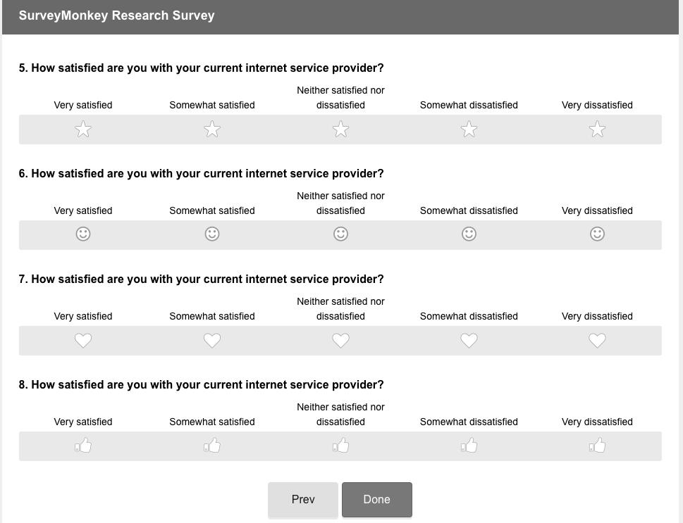
One of the most used Web surveys tools is the humble radio button. It has been with us from the beginning of the internet and it continues to be the main way to collect answers in Web surveys. In a recent paper with Mingnan Liu we have looked into the possibility of replacing the traditional radio button with other symbols such as: hearts, stars, smiley faces and thumbs.
Investigating the new design
Our question is pretty straightforward. We wanted to see if using these symbols instead of the radio button leads to higher satisfaction with the survey but does not have a negative effect on data quality. We also wanted to see if the findings are stable under a number of different conditions: number of response categories (5 vs. 7), type of scale (uni-polar or bi-polar) and labels used (with or without labels). We crossed all of these experimental groups and applied them in SurveyMonkey nonprobability panel in the US.
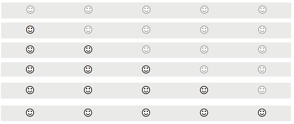
And now to the exciting summary of our findings: not a lot is going on. Overall, there are no differences in data quality or respondent satisfaction between the radio buttons and the new response scales. Two differences stand out. Firstly, the smiley face scale had higher item missing and lower satisfaction, both compared to radio buttons and the other symbols. Secondly, the new response scales were faster to complete. Given that the quality was similar to radio buttons it might indicate that the cognitive burden is lower (which might be an advantage).
Should you get rid of radio buttons in your survey?
In conclusions, should we get rid of radio buttons? It’s still early days. Further testing is probably needed, especially in longer and more complex surveys. That being said there is some indication that we can replace the radio buttons in surveys without loss to data quality but also with no increase in the satisfaction of the respondents. Combining the new response scales with other approaches such as gamification might be worth considering.
If you want to read more about this research you can have a look at our recently published paper in the International Journal of Market Research. Unfortunately, the paper is not open access but you should be able to access a free version using this link.
More blog posts
 Why do people take longer to do surveys by mobile?
 When less is more: improving survey invitations
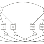 Are web survey answers similar to face to face ones?
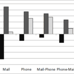 Are you mixing your survey modes the right way?
 Understanding mode of interview switching in longitudinal surveys
 How do interviewers influence the study of discrimination?